KEM BEAUTY — BRAND & IDENTITY
ART DIRECTION · DIGITAL · PRODUCT
Redefining accessible beauty
KEM Beauty set out to create a more accessible, functional approach to cosmetics, combining science-backed products with a brand designed for a diverse Millennial and Gen Z audience. The identity was built to balance clarity and credibility with cultural relevance, creating a clean, modern aesthetic that felt both inclusive and elevated within the evolving beauty landscape. This translated across a refined visual system, spanning photography, logo, typography and colour, alongside a new Shopify experience and packaging design.
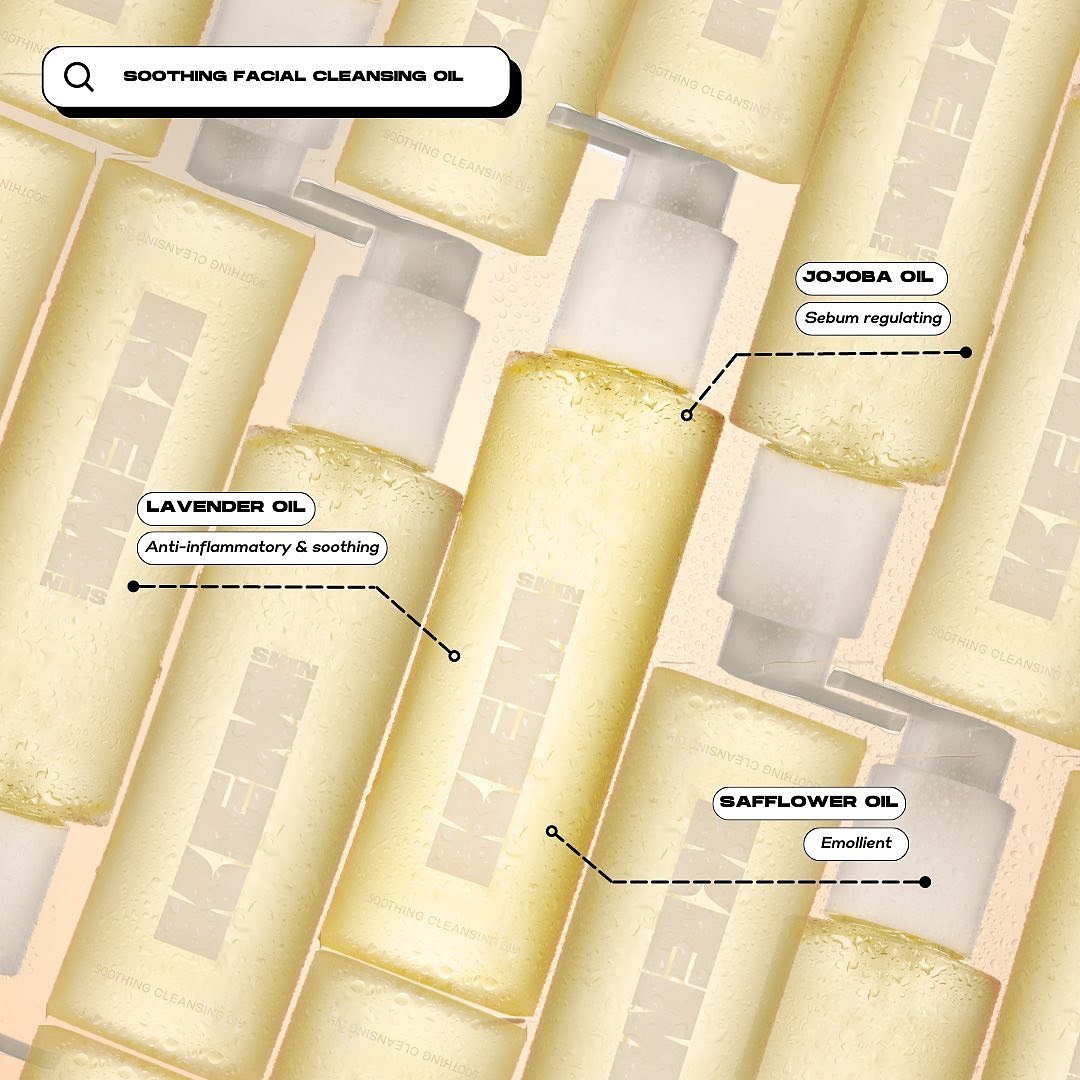
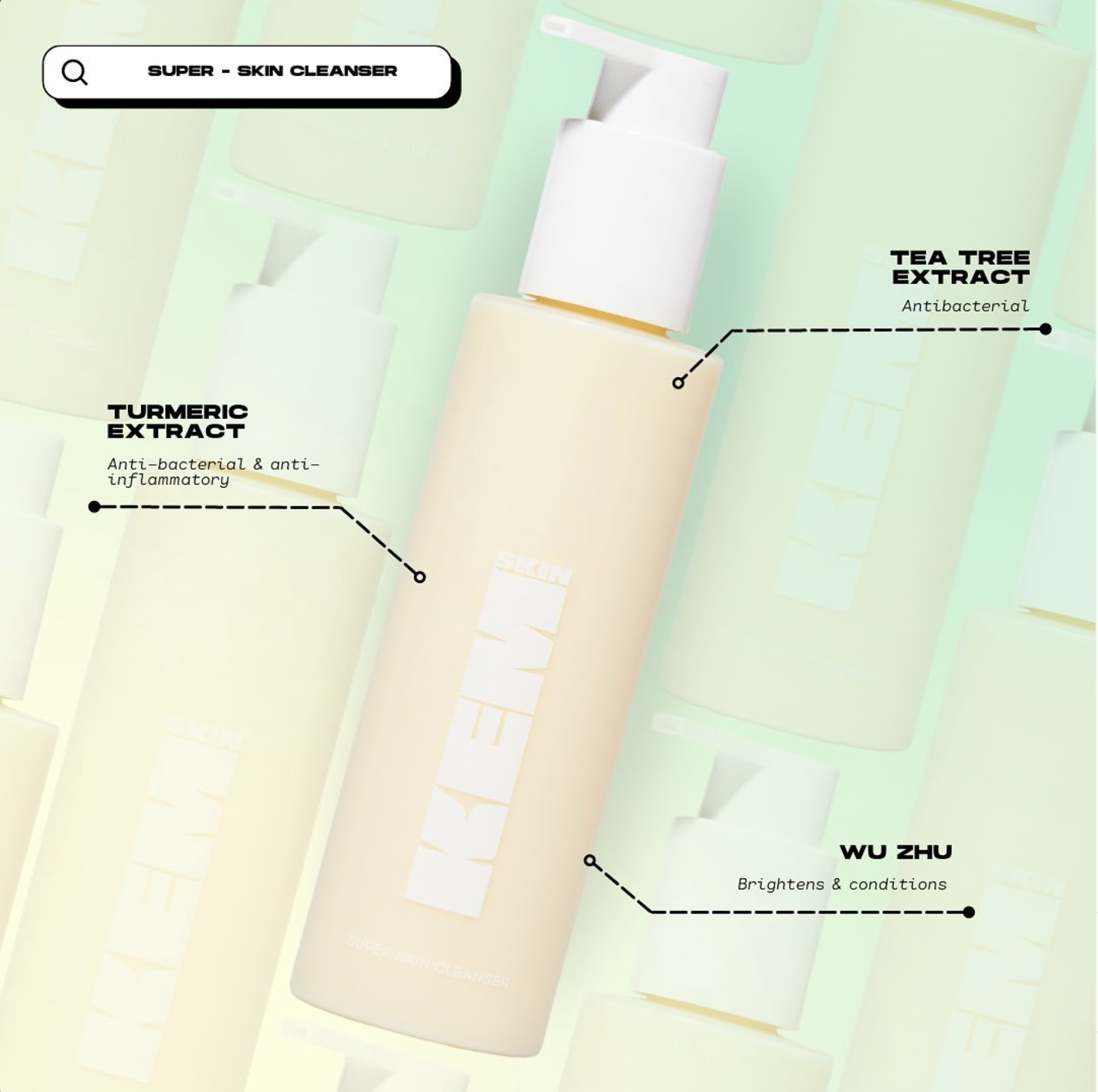
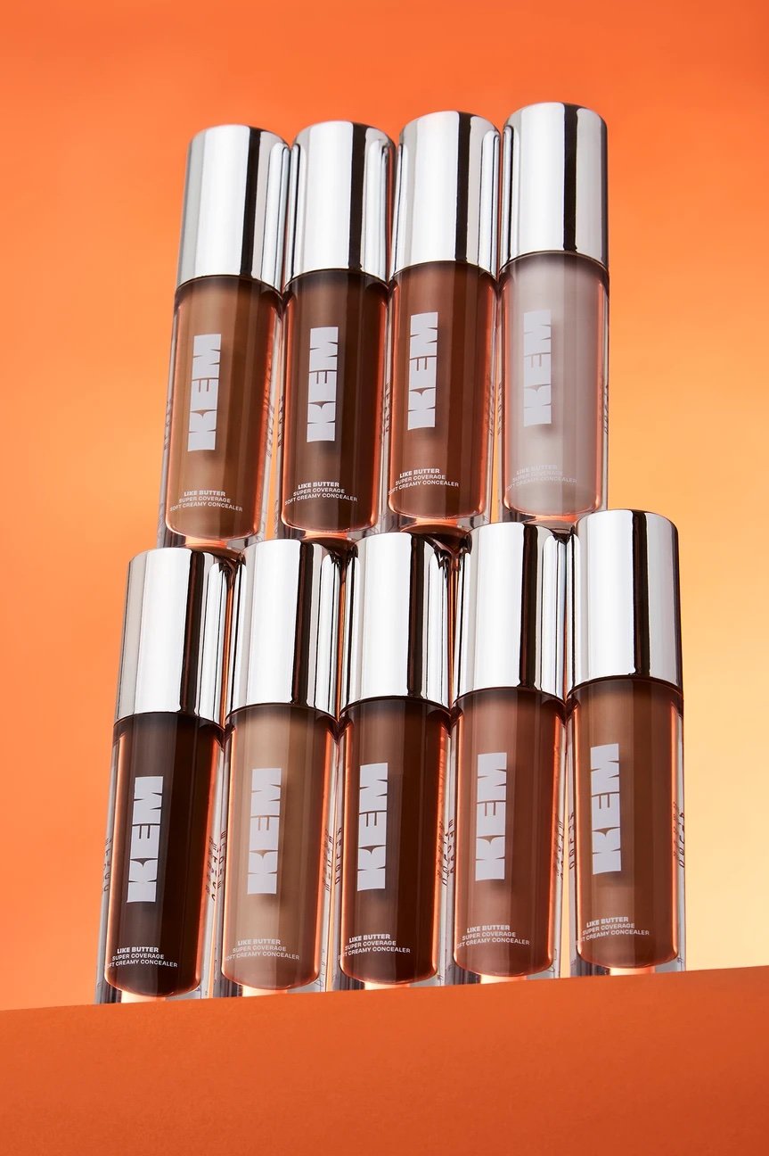
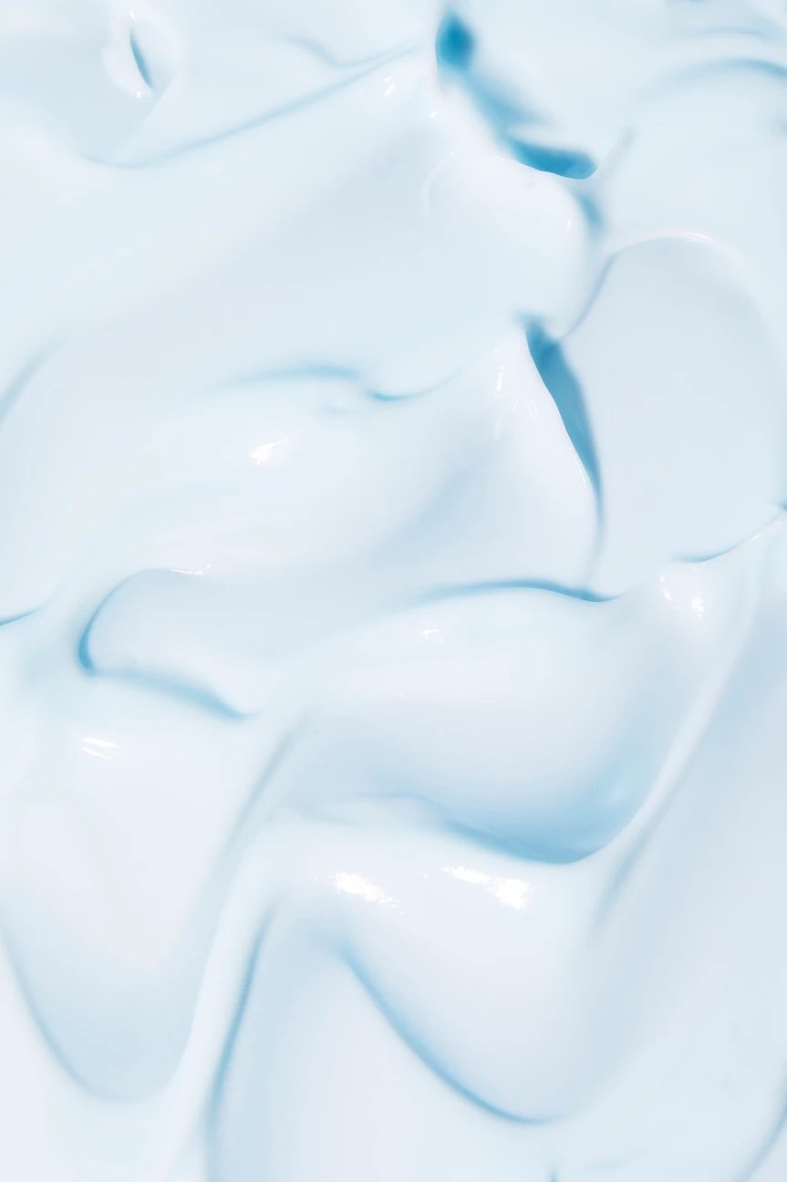
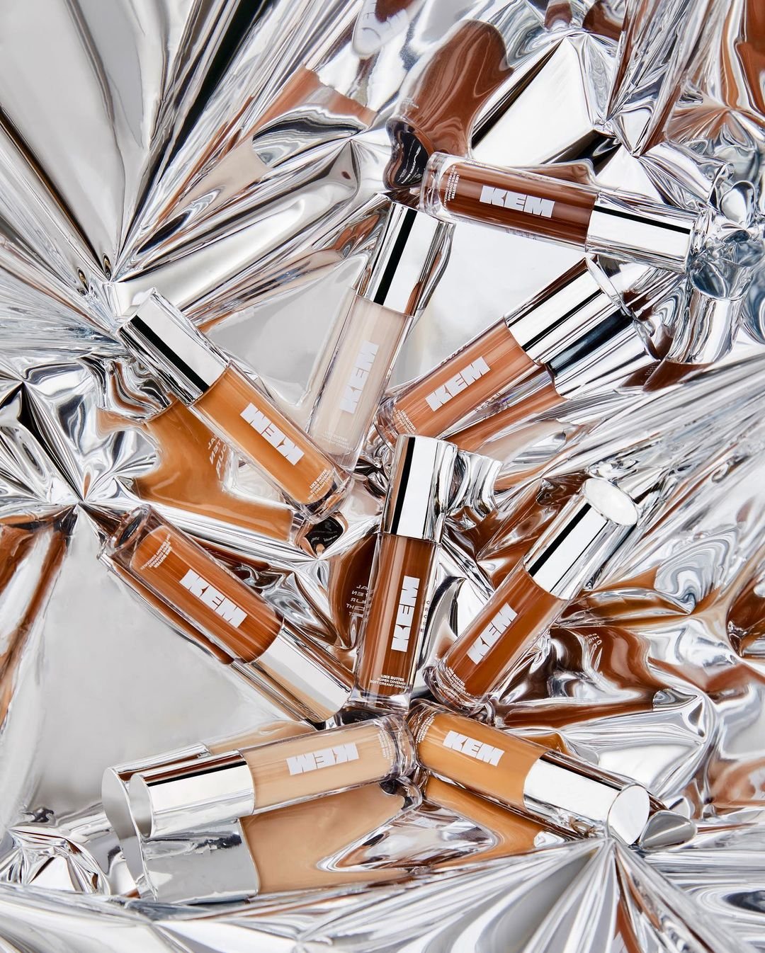
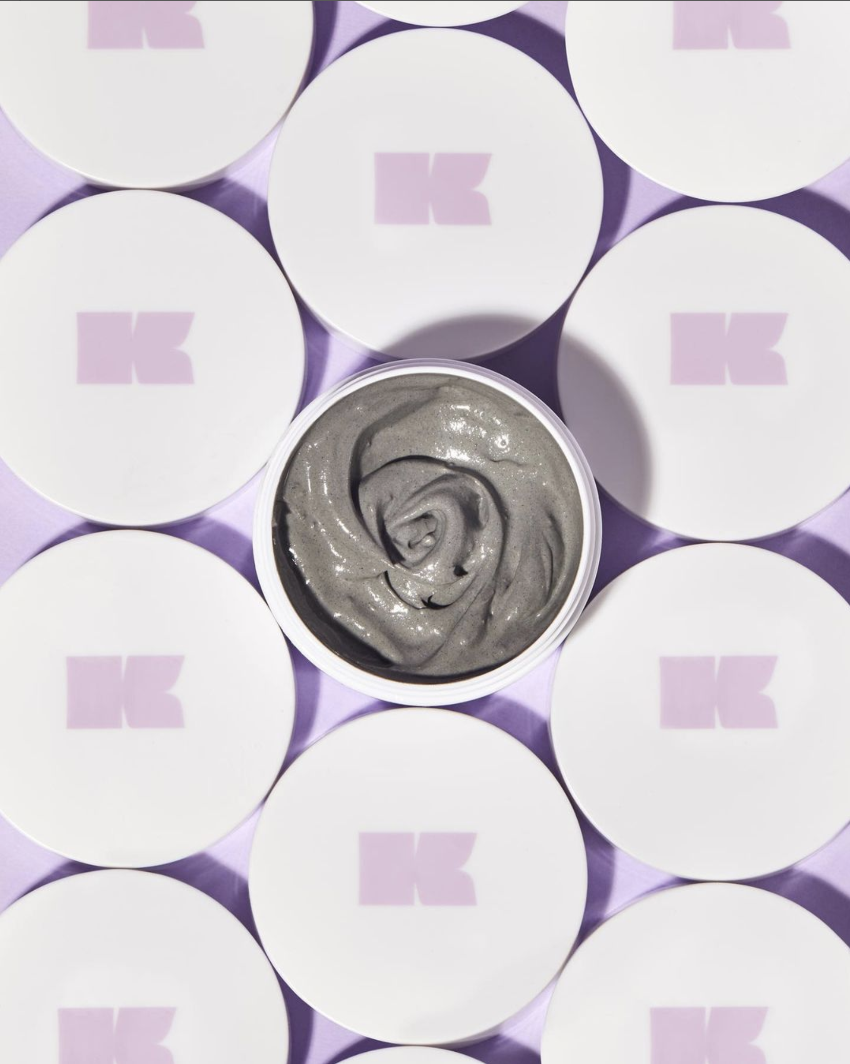
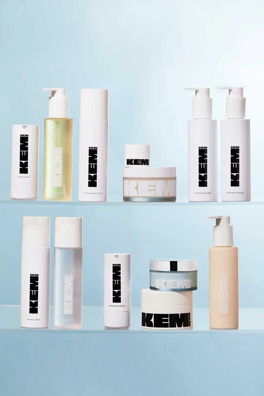
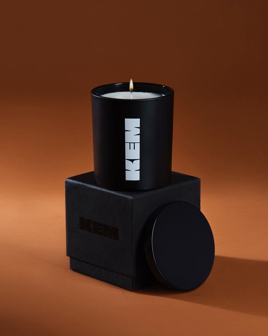
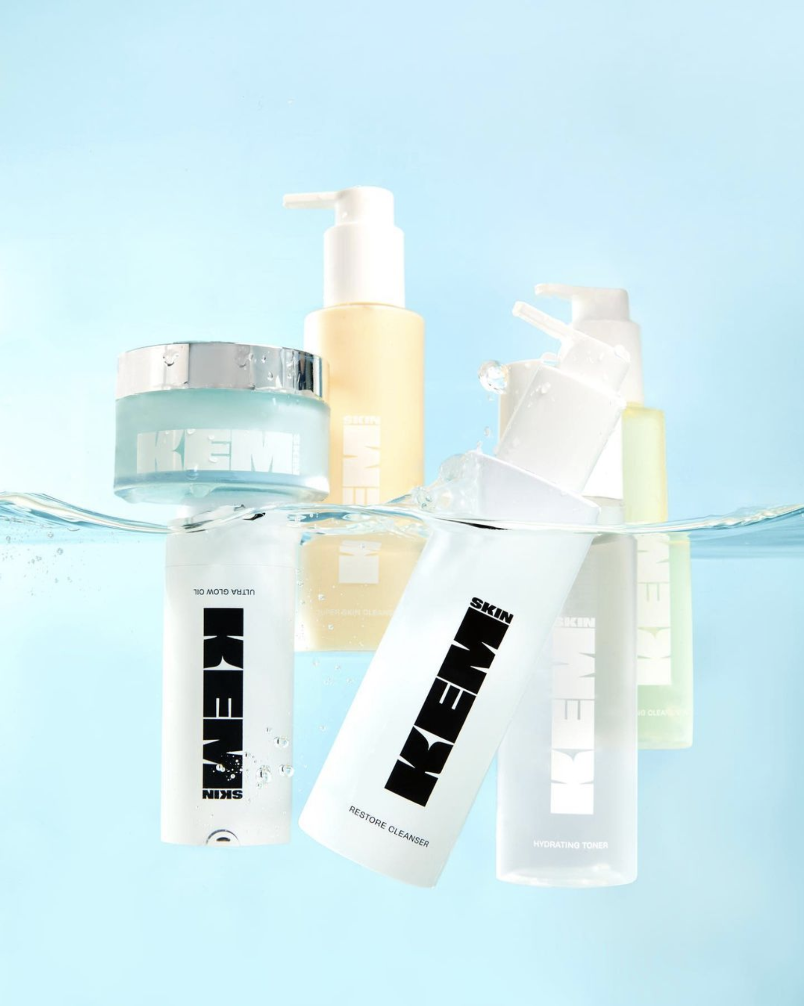
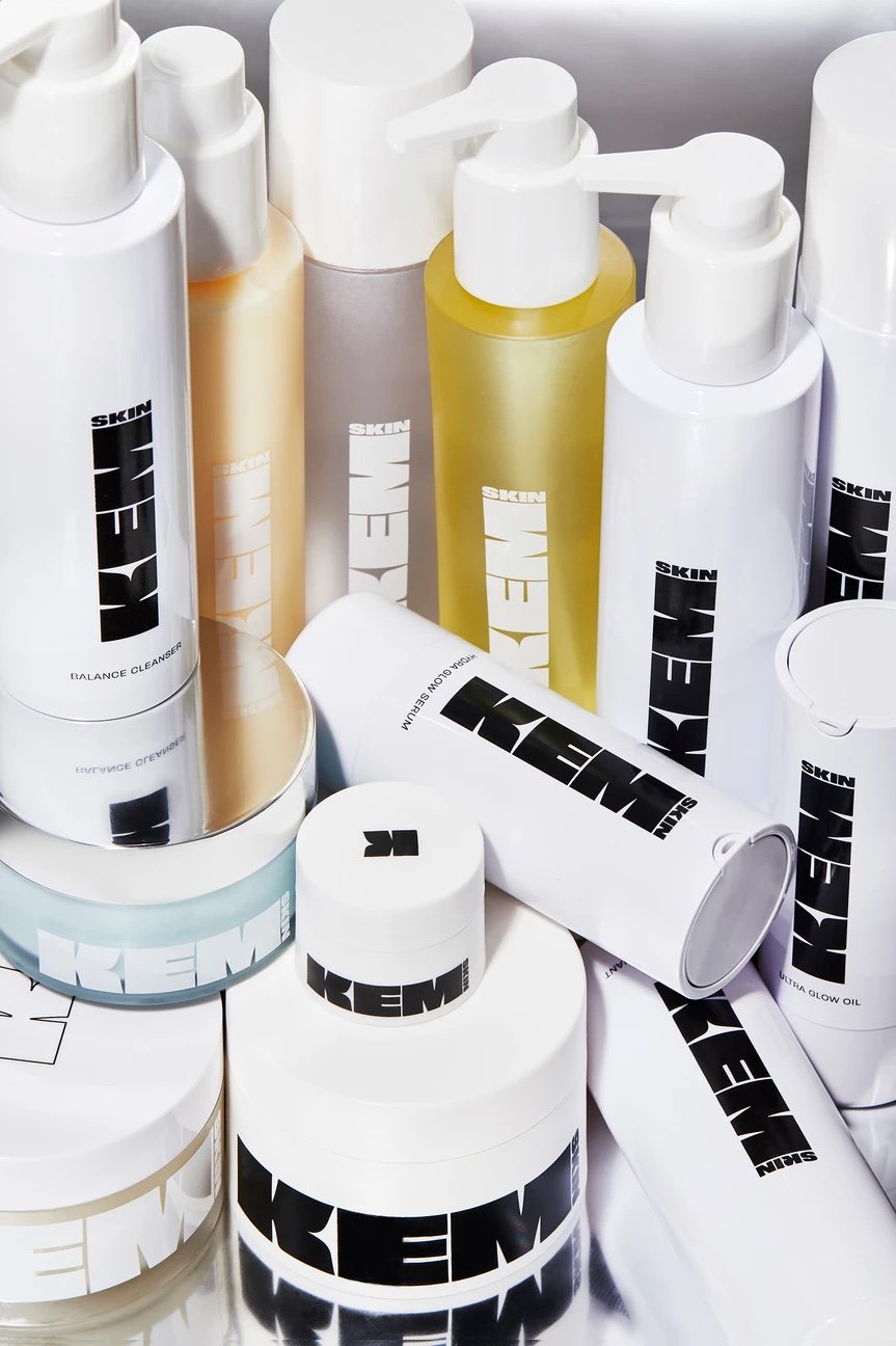
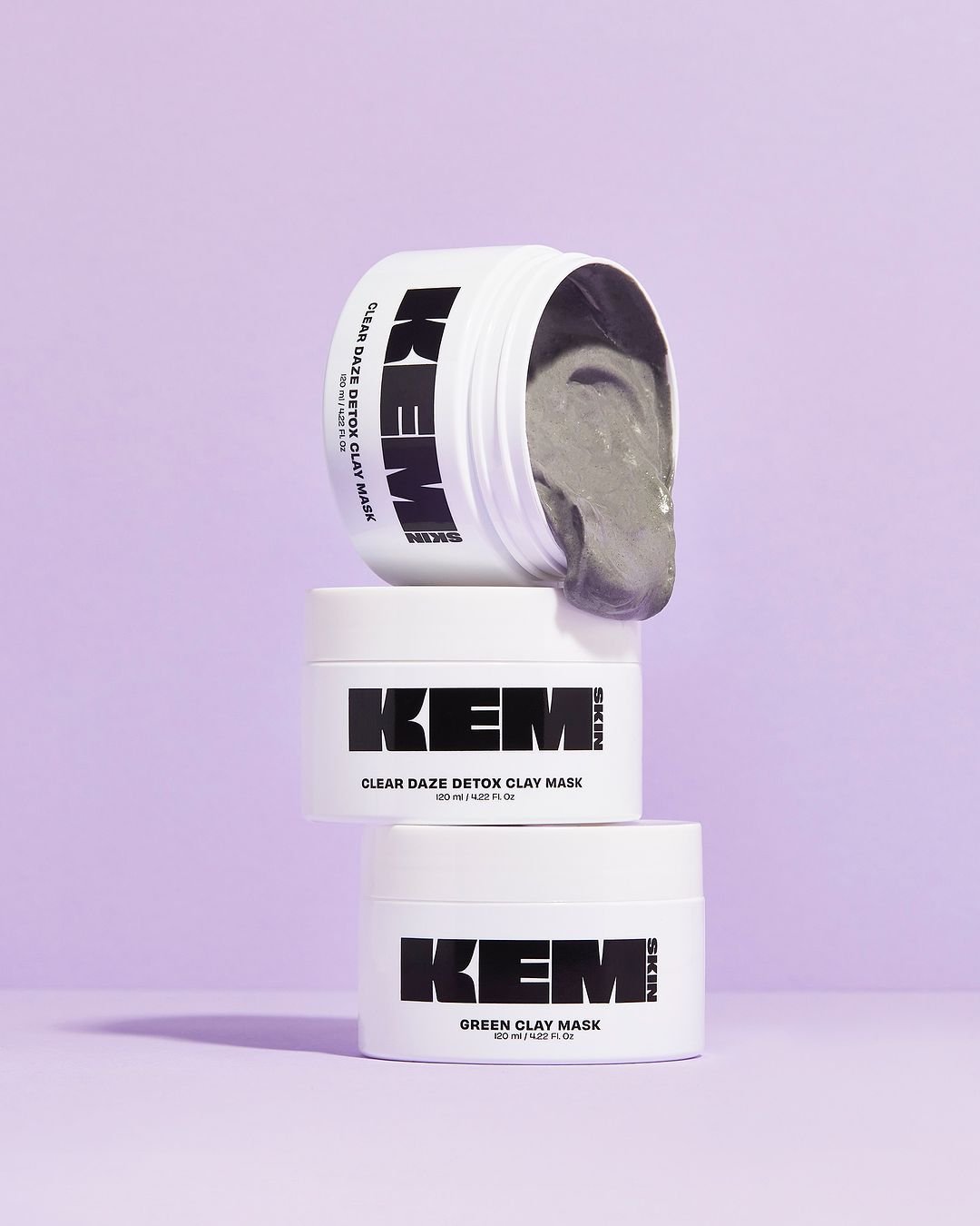
Product images
Art Direction RIANNA OSANWUTA
Photography VICTORIA CHETLEY


KEM ‘Better Everyday’ Campaign
Promotional video for website and socials.
Art Direction RIANNA OSANWUTA
Direction, film and edit JEDIDAH M.
Casting and Production KEM BEAUTY
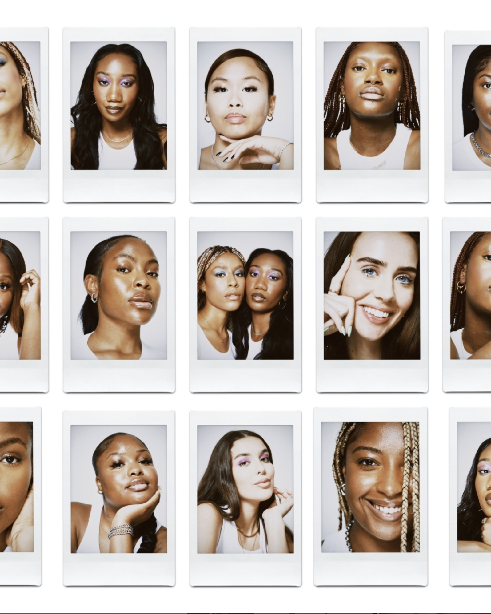
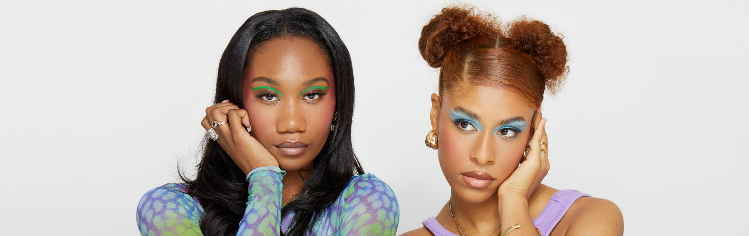
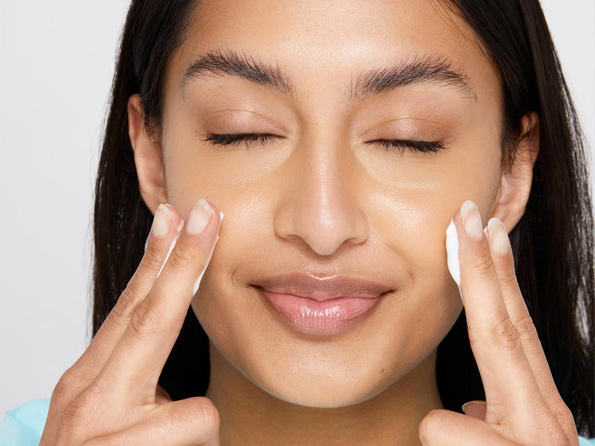
Campaign images
Art Direction RIANNA OSANWUTA
Photography AGATA KOCON


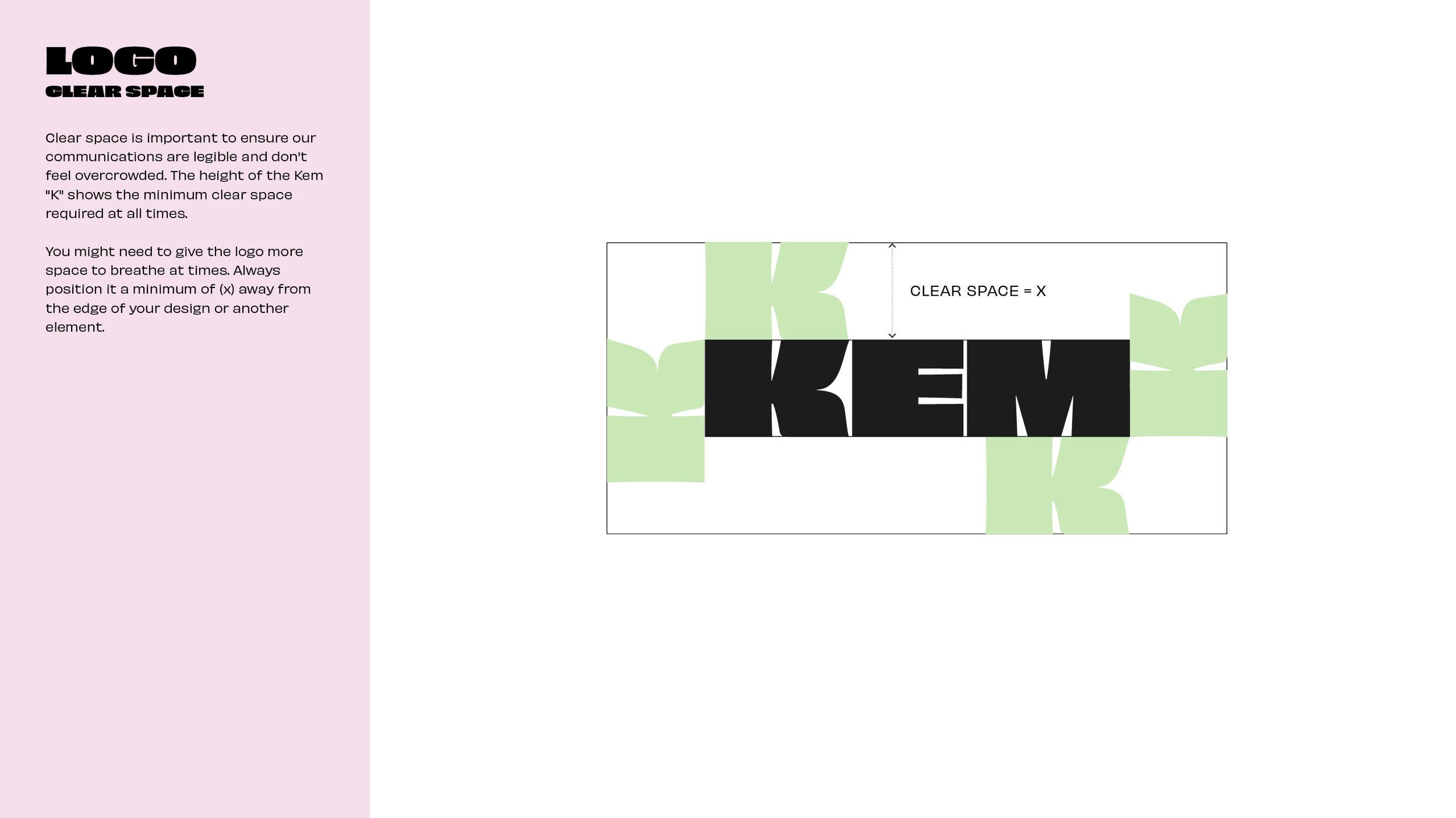
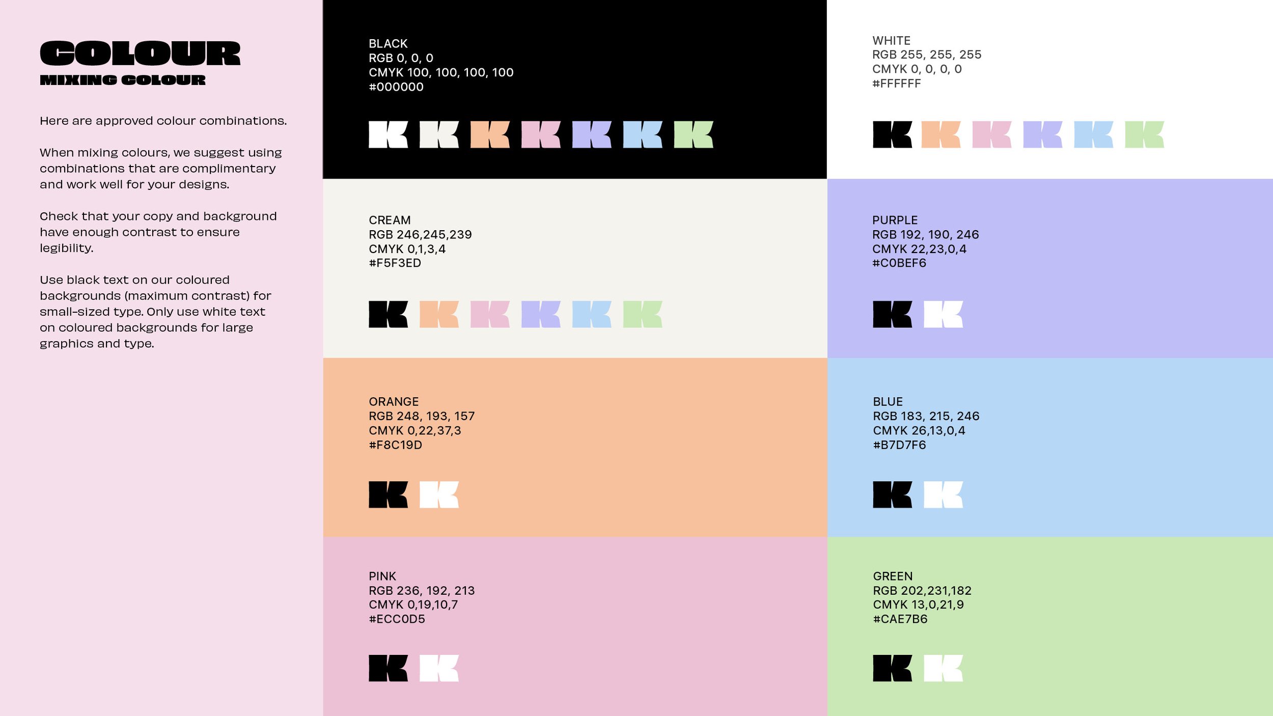
Logo


Logomark

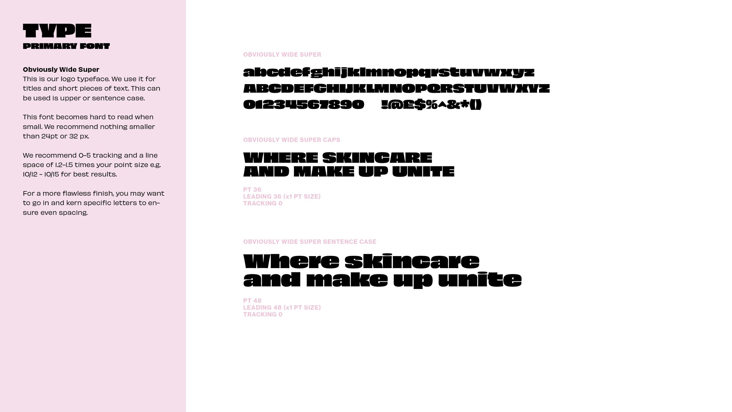
Brand guidelines

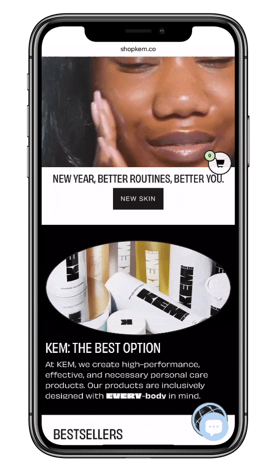
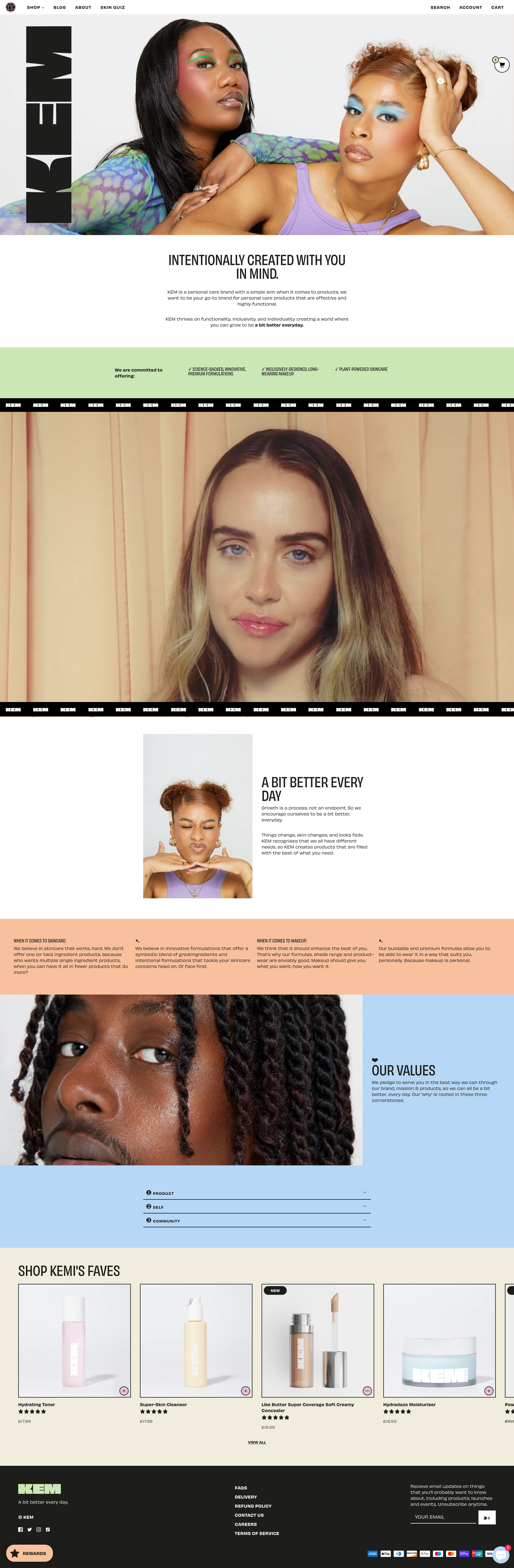
Responsive Web design


Content
Social media graphics